Create the perfect data slide
Can you give me the trends of our sales in volume and value over the last 9 years?
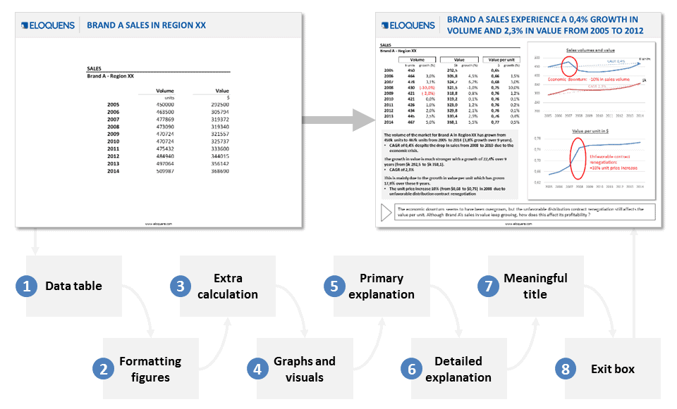
Well, you can either hand out your rough table of figures or create a powerful slide that will make your data much easier to read and your decision-making much clearer. Here are 8 steps to create go from a rough table of figures to a powerful data analysis:
Step 1 – Here is your raw data
Get your rough data from your marketing or finance department. Check its accuracy (you don’t want to work on false data).

Step 2 – Format your figures
Make your figures more readable. For this there are two things in particular you can do:
a) Change your units. Make sure it is a relevant unit. Once in the unit, the numbers should be neither too big nor too small.
b) Format your figures so that only significant numbers appear. As a rule try to follow the norm of three significant numbers. You might also want to add colors for your data to make them stand out when necessary or to simplify the reading (for example negatives in red).

Step 3 – Add extra calculation
You can add a lot of value to your raw data by just adding a few simple calculations. For example when you study a trend, add the percentage of growth. When you study several competitors, add a performance index. When you study volumes and value, add a value per unit, and so on.
These simple calculations provide extra information that will help your audience understand your analysis quicker and also highlight some phenomena that might not have been apparent in your rough data. Also, don’t forget to keep your format consistent with your changes in Step 2.

Step 4 – Create relevant visuals
Visuals are much more self-explanatory than data, especially for data trends or data comparisons. Graphs will probably be less precise than raw data but they bring so much value through instant visualization that they are worth it. For the graph to be instantly useful, don’t forget to give it a title and legend even if you leave the raw data next to it.

Step 5 – Add textual explanation
To help your audience get even more value from your data you can write the key lessons from your data analysis and visualizations in a text box on your slide. Focus on the key learnings.
Two to five key learnings per slide is a good benchmark. Even if though this is textual, remind your audience of the relevant data to which you are referring. Your textbox should really stand by itself and could be read on its own with no graph or table. This is also the text you could say for an oral presentation when presenting the data.

Step 6 – Add even more explanation
On your graph, table or on your textbox add even more details so that your audience can have a deeper understanding of your slide. These details can be means, medians or cumulated growth, elements of context that can explain the data etc. Include any information that will be of extra value to your listener in the context of your study. Be careful though to not overload your slide that with too much extra databecause it could end up being unreadable.

Step 7 – Add a meaningful title
Your title brings more value when its says “Brand A Sales Experience, 0.4% Growth in Volume and 2.3% in Value From 2005 to 2012” than when it says “Brand A Sales”, obviously! As a rule try to make your title sum-up the slide or give the main takeaway point of the slide.

Step 8 – Finish with an exit box
This step is all the more crucial if you intend to use this slide inside a full presentation. This exit box should:
– highlight the main issue(s) raised by the slide
– open the way for more analysis (that will be tackled in the next slide of your presentation)
Don’t write more than two lines in your exit box or it will override the rest of the slide. Don’t neglect step 7 and step 8 as the title and the exit box will most probably be the most read two parts of your slide.

And now you are done and you have moved from a pretty rough (and not very appealing) table of figures to a powerful data analysis that will bring so much more value to your study. You can view and share this post through its sum-up presentation here on slideshare:
This post was inspired by a Boston Consulting Group video called “Evolution of a Killer Slide”, posted in 2011. You can view it here :


Leave a Reply
Want to join the discussion?Feel free to contribute!